OS Style settings view

Do you have a MacOS app but can't get your setting page to look good, here is how you can make your settings view look MacOS like.
Introduction
There are many ways to let your user change different settings, you can have it inline with the function they’re using, and/or combine them in a settings page. In this post we’re going to look at a simple and nice way to get this working.
Old vs New
For MacOS, adding a settings page can be done by adding Settings to your main app. For my App Clicker I made a quick and simple settings page, without realising there is a better way to do this. I only started noticing this when I wanted to add more details to the settings page that it didn’t work well.
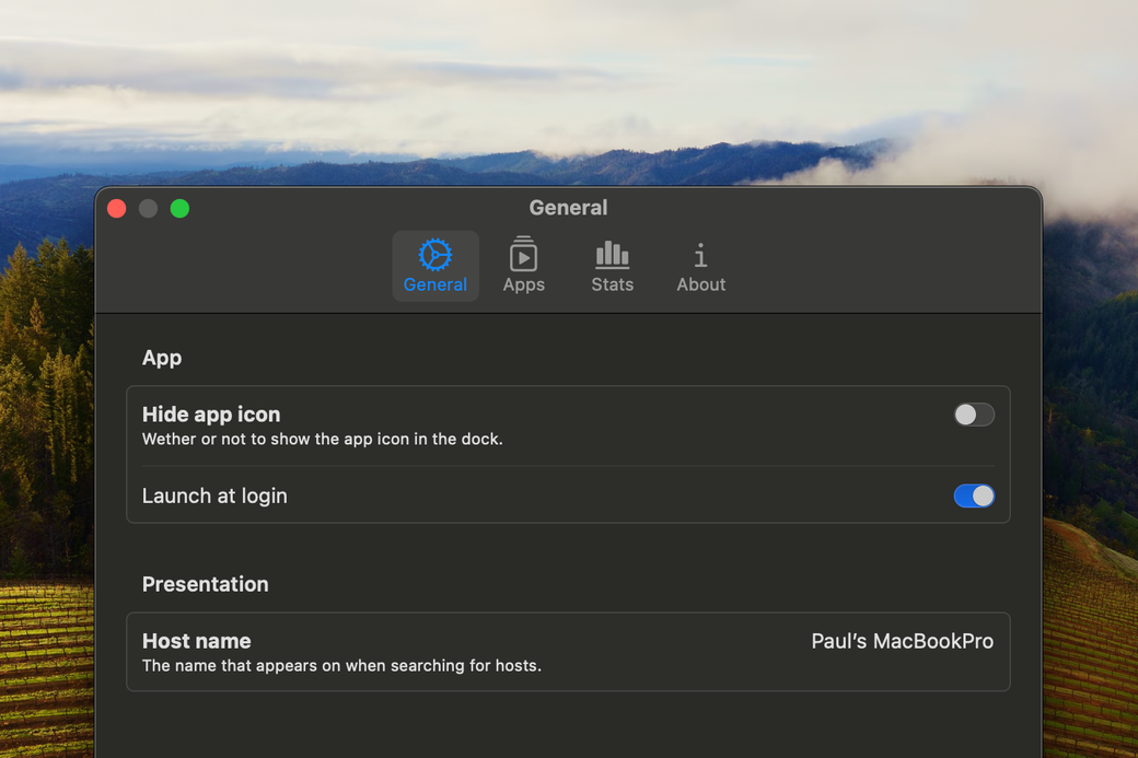
So, this is how my settings page looked in Clicker version 0.2.0:

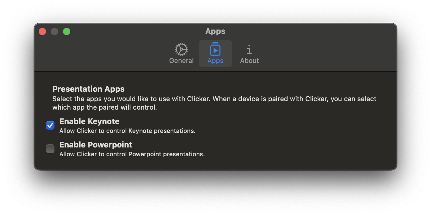
After my updates, the same views look like this:

Adding Settings to your app
The two most common ways to have a settings view is by either using a NavigationSplitView with only the details view and sidebar, or using TabBar. For us, lets start off with simple page that changes some app storage settings.
Lets start off with just a view that contais the settings. On your project, create a new view called GeneralSettingsView.swift with the following code:
import SwiftUI

struct GeneralSettingsView: View {
    @State private var settingOneValue = false
    @State private var settingTwoValue = false
    @State private var settingThreeValue = false

    var body: some View {
        VStack {
            HStack {
                VStack(alignment: .leading) {
                    Text("Title")
                        .font(.title2)
                    Text("Subtitle for the setting, explaining what it does")
                }
                Spacer()
                Toggle("", isOn: $settingOneValue)
            }
            HStack {
                VStack(alignment: .leading) {
                    Text("Title 2")
                        .font(.title2)
                    Text("Subtitle for the setting, explaining what it does")
                }
                Spacer()
                Toggle("", isOn: $settingTwoValue)
            }
            HStack {
                VStack(alignment: .leading) {
                    Text("Title 3")
                        .font(.title2)
                    Text("Subtitle for the setting, explaining what it does")
                }
                Spacer()
                Toggle("", isOn: $settingThreeValue)
            }
        }
    }
}

#Preview {
    GeneralSettingsView()
}
You should now have a simple page showing toggles to the right, each item having tite and subtitle. Now, in your App file, lets add a settings page by adding the following code right beneath the WindowGroup of the App:
Settings {
GeneralSettingsView()
.padding()
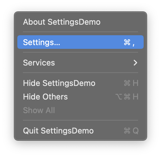
}Now, if you launch your app, you should see a settings option in the app’s finderbar menu, like so:
And the settings view should look like:
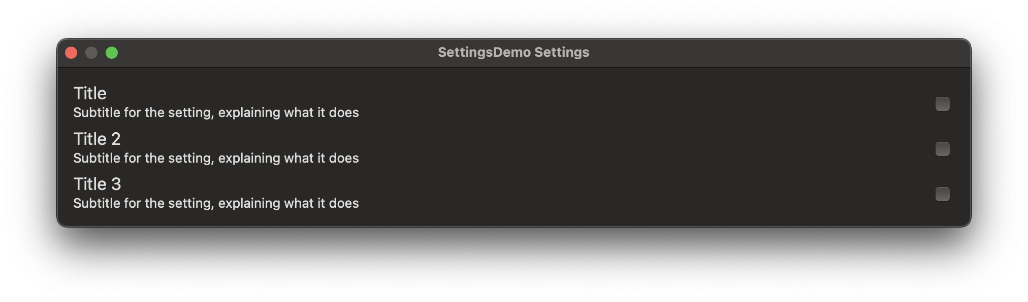
The reason why I chose to add seperate VStacks and not use the option to add it directly to the Toggle, is because I’ve seen a bunch of questions on e.g. Stackoverflow where people choose to seperate their views and I want to show in this post why you shouldn’t do that.
Updating the UI
The second UI in the view shown above uses Form and Groups for the UI, so lets start off with updating our UI to use the view added to a Toggle.
Lets exchange the above HStacks with toggles and VStack for the following.
            Toggle(isOn: $settingOneValue, label: {
                VStack(alignment: .leading) {
                    Text("Title")
                        .font(.title2)
                    Text("Subtitle for the setting, explaining what it does")
                }
            })

            Toggle(isOn: $settingTwoValue, label: {
                VStack(alignment: .leading) {
                    Text("Title 2")
                        .font(.title2)
                    Text("Subtitle for the setting, explaining what it does")
                }
            })

            Toggle(isOn: $settingThreeValue, label: {
                VStack(alignment: .leading) {
                    Text("Title 3")
                        .font(.title2)
                    Text("Subtitle for the setting, explaining what it does")
                }
            })
Now your settings view will look like this:
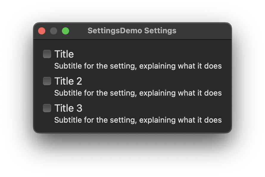
… Not ideal yet… but better.
Adding groups
Finalising the UI by adding groups is the last thing to do here, lets change out our root vstack for Form and lets add some sections. Lets update the code to the following:
    var body: some View {
        Form {
            Section {
                // Toggle 1
            } header: {
                Text("Section 1")
            }

            Section {
                // Toggle 2 & 3
            } header: {
                Text("Section two")
            }
        }
    }
As you might have noticed, I removed the toggles above, but this you shouldn’t do. I only did this to emphasise the changes I made.
Now, there is one thing left… you need to set the form style to the form by adding:
.formStyle(.grouped)below the closing } of Form. Since the default form style is .columns, you need to change it to .grouped so SwiftUI knows how you want it formatted. Now your view should look like this:
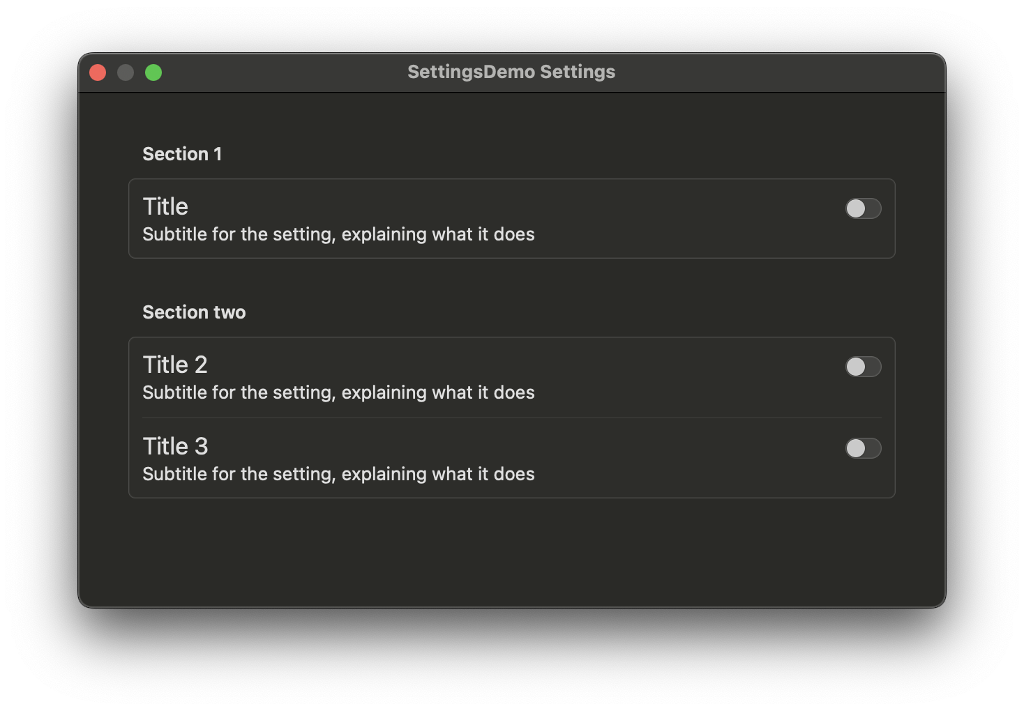
It can happen that the view is too small, you can resize it so it fit. You could add .frame(width: 800, height: 600) if you want a fixed size.
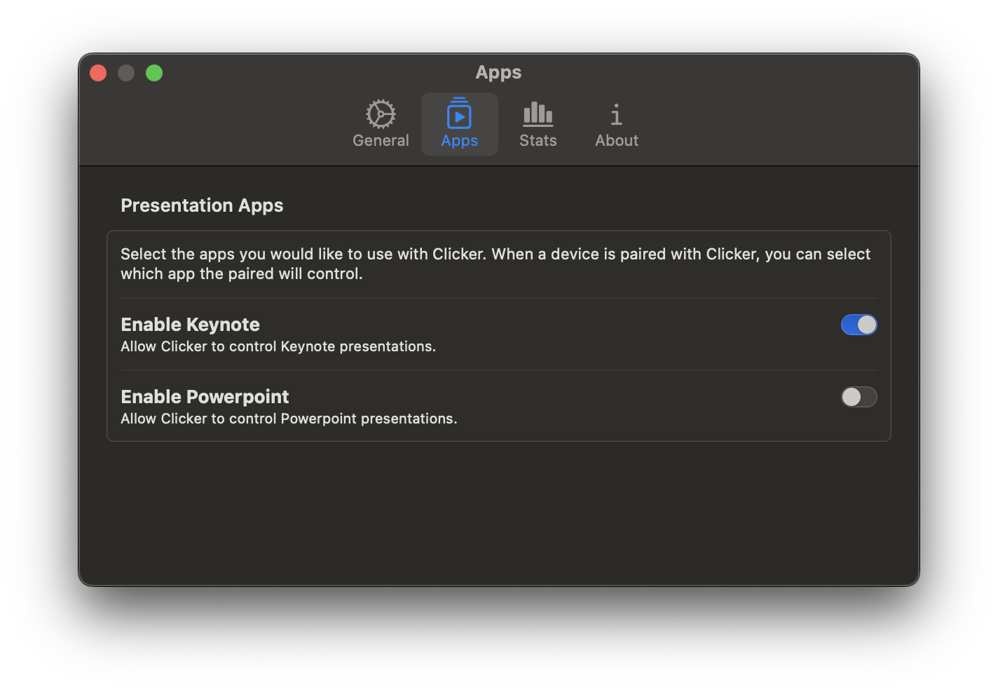
The end result should now be:


